
User Experience Optimization for Restaurant Equipment Ecommerce
User experience optimization is all about making your website as easy and enjoyable to use as possible. It’s about getting rid of the friction points, making things crystal clear, and helping your customers find what they need without wanting to pull their hair out. For an online store, a great experience is the straightest line to higher conversions and more sales.
Why Better UX Sells More Restaurant Equipment
Let's be blunt: a clunky, slow, or confusing website is a hole in your pocket. It’s a direct leak in your revenue pipeline. Your customers—busy restaurant owners, chefs, and kitchen managers—are dealing with a thousand things at once. Time is their most precious, and most limited, resource. They simply don't have the patience to fight with a poorly designed site, especially when they're about to drop a few thousand dollars on a new combi oven.
This isn’t about making things look pretty. It’s a core business strategy that directly impacts your bottom line.

Picture a head chef trying to order a replacement convection oven in that brief quiet spell between the lunch and dinner rush. They grab their phone, land on your site, but can't easily compare models or find a downloadable spec sheet. That’s a lost sale, right there. They’ve already moved on to a competitor who makes their life easier. The opportunity cost of a bad user experience is massive.
The Financial Impact of a Seamless Experience
Putting money into a better online experience isn’t an expense; it’s a high-return investment. The numbers don't lie. Research has shown that every $1 invested in UX can bring back $100—that’s a staggering 9900% ROI.
On the flip side, ignoring UX is a recipe for disaster. A whopping 88% of mobile users will ditch a site if it doesn't work well on their device. When you consider how much B2B purchasing now happens on phones, that's a failure you can't afford. You can find more stats on UX performance over at UXCam.com.
The message is clear. Your customers are making serious B2B buying decisions, often under pressure and on the go. Your website needs to be a reliable tool that helps them, not another problem they have to solve.
To give you a clearer picture, here’s a quick breakdown of what goes into a solid UX strategy for an online store.
Core Pillars of User Experience Optimization for Ecommerce
| Pillar | Key Focus Area | Impact on Business |
|---|---|---|
| Usability | How easy is it for users to accomplish their goals? This includes intuitive navigation, clear product pages, and a simple checkout. | Reduces friction, lowers bounce rates, and directly increases conversion rates. |
| Accessibility | Can users of all abilities access and use your site? This means catering to screen readers, keyboard navigation, and visual impairments. | Expands your potential customer base and builds a positive brand reputation. |
| Performance | How fast does your site load? Slow speeds are a primary reason for abandonment, especially on mobile devices. | Improves user satisfaction, lowers bounce rates, and positively impacts SEO rankings. |
| Desirability | Do customers enjoy using your site? This emotional connection is built through clean design, helpful content, and a trustworthy brand feel. | Fosters brand loyalty, encouraging repeat business and positive word-of-mouth. |
Thinking about these pillars helps frame your efforts, ensuring you're building a site that is not just functional, but genuinely effective at driving business.
A great user experience turns a one-time visitor into a repeat customer. It builds trust and brand loyalty by showing you understand and respect your customer's time and operational needs.
Key Benefits of Prioritizing UX
When you put serious effort into your site's usability, you’ll see tangible benefits that go way beyond just looking professional. It's about creating a smooth, confident path from the moment someone lands on your site to the final purchase confirmation.
Here’s what you stand to gain:
- Increased Conversion Rates: A simpler, more intuitive journey means more visitors actually complete their purchase.
- Higher Customer Loyalty: When buyers have a good experience, they know where to go for their next purchase, whether it's a few smallwares or a full kitchen fit-out.
- Reduced Cart Abandonment: Nailing the checkout process, especially on mobile, is one of the fastest ways to capture sales that would otherwise be lost.
- Stronger Brand Reputation: A professional, easy-to-use site sends a powerful message about the quality of your products and your commitment to service.
Ultimately, great UX makes your website your best salesperson—one that works 24/7 to help customers find exactly what they need, effortlessly.
Giving Your Website a Foundational Health Check
Before you can start making meaningful improvements, you need a clear, unbiased picture of what’s actually happening on your site. A foundational health check—what we call a UX audit—is your first move in diagnosing the real issues that are costing you sales. This isn't about guesswork. It’s about digging into the data to find the exact points of friction your customers are hitting.
Think about a kitchen manager scrambling to find spec sheets for a combi oven on their phone during a busy service. If your site is slow, a nightmare to navigate, or full of broken links, they're gone. This initial audit is all about uncovering those hidden roadblocks. The best part? You can get started with a few powerful, free tools to see your website through your customers' eyes.
Uncover User Behavior with Analytics
Your first stop should always be Google Analytics. This tool is a goldmine for understanding how real people interact with your restaurant equipment store. Don't just glance at the top-level traffic numbers; the real insights are buried in reports that shine a light on UX problems.
Start by digging into the Behavior Flow report. It gives you a visual map of the paths users take from one page to the next. Are they successfully moving from a commercial refrigeration category to a specific product, or are they bailing immediately? A massive drop-off on a key category page is a huge red flag that something is wrong.
Next, check your Exit Pages report. If you see a high percentage of users leaving from a specific product page—or worse, the first step of your checkout process—you’ve found a fire that needs to be put out immediately. These aren't just abstract numbers; they represent lost sales and frustrated chefs.
A proper UX audit transforms vague feelings about your website into a concrete, data-backed action plan. It replaces "I think our product pages are confusing" with "Data shows 40% of users abandon our convection oven pages without clicking 'Add to Cart'."
Diagnose Critical Speed Issues
In e-commerce, speed is money. Period. Even a one-second delay in page load time can tank your conversion rates. Your customers are busy professionals, and they expect instant results.
Use Google's PageSpeed Insights to get a clear performance score for your site on both mobile and desktop. This tool does more than just tell you you're slow; it gives you a specific, actionable diagnostic report.
- Largest Contentful Paint (LCP): This is all about perceived load time. How long does it take for the main content, like that big product hero shot, to appear? A slow LCP means users are just staring at a blank screen.
- First Input Delay (FID): This tracks responsiveness. When a user first tries to click a filter or a button, how quickly does the site react? Lag here feels clunky and unprofessional.
- Cumulative Layout Shift (CLS): This measures visual stability. We've all experienced this—you go to click a button, and an ad loads, pushing the button down, causing you to click the wrong thing. It’s infuriating, and it kills trust.
For a much deeper dive into the technical side of a performance review, our guide on how to do a site audit has more advanced tips.
Perform a Basic Accessibility Check
Finally, it’s crucial that your website is usable for everyone, including people with disabilities. An accessible site isn't just an ethical and often legal requirement—it’s just good business that opens your doors to more customers.
Start with a simple gut check. Can you navigate your entire site using only your keyboard? Try using the "Tab" key to move between links and buttons. If you can't reach the "Add to Cart" button or get stuck in the main menu, you have an accessibility problem.
Also, make sure your product images have descriptive alt text. This is what screen readers announce to visually impaired users, allowing them to understand what's in the picture. To systematically check your site, an e-commerce user experience audit checklist is an essential tool to guide you through these fundamental checks and more.
Getting Inside Your Customer's Head with User Research
The data you pulled from your analytics audit tells a story of what is happening on your site, but it almost never explains why. If you really want to move the needle on user experience, you have to stop guessing what your customers want and start asking them.
User research can sound intimidating and expensive, but it doesn't have to be. For a restaurant equipment supplier, it just means getting honest feedback from the chefs, GMs, and procurement managers who actually use your website. These are practical, busy people. Your research methods need to be just as practical and respect their time.
Practical, Low-Cost Ways to Learn What They're Thinking
You don't need a huge budget or a dedicated research team to find game-changing insights. A few simple, targeted methods can quickly shine a light on the biggest friction points your customers face. The key is to be consistent and genuinely curious about their challenges.
I always recommend starting with these high-impact approaches:
- Simple Customer Surveys: Use a tool like Google Forms or SurveyMonkey to build short, focused surveys. Ask pointed questions like, "What was the hardest part of finding spec sheets on our site today?" or "On a scale of 1-5, how easy was it to compare different commercial freezer models?"
- Informal Customer Interviews: Find a few loyal, repeat customers and ask for just 15 minutes of their time. A quick phone call can uncover pain points analytics would never show you. You might learn they can never find warranty info or that your site's search bar doesn't understand common industry terms.
- Session Replay Analysis: This is one of my favorite methods. Tools like Hotjar or FullStory let you watch anonymized recordings of real user sessions. It’s like looking over your customer's shoulder as they browse. You can literally see where their mouse hovers in confusion, where they rage-click a broken button, or the exact moment they abandon their cart in frustration.
User research isn't some academic exercise; it's the most direct path to making smarter business decisions. It replaces your assumptions with cold, hard evidence, ensuring your time and money go toward solving real problems for real customers.
Turning "Interesting" into "Actionable"
The real magic happens when you turn these observations into concrete actions. Research provides the "why" behind the numbers, giving you a clear mandate for change.
Imagine watching three separate session replays where users try to find the "Compare" feature for different deep fryers, fail, and leave the page. That's not just an interesting tidbit; it's a data-backed reason to redesign that feature to be more prominent and intuitive. You’ve just identified an issue that is actively blocking revenue.
This commitment to understanding the user is becoming a major differentiator. In fact, 42% of companies plan to increase their UX budgets by over 30% in the next year. With 77% of brands now viewing customer experience as a key competitive advantage, ignoring direct user feedback is a risk you can't afford to take. You can dive deeper into these trends in Userlytics' 2024 State of UX report.
Crafting Surveys That Actually Get Responses
Your customers are busy running kitchens and businesses. To get them to complete a survey, you have to make it fast, easy, and relevant. Keep it focused on a single topic, like their checkout experience or how they use the product filters.
Here are a few tips I've learned for getting better survey responses:
- Keep it Short: Aim for 5-7 questions, max. Anything longer and you’ll see a massive drop-off rate.
- Use Plain Language: Avoid internal jargon. Ask questions the same way a customer would speak.
- Offer a Small Incentive: A simple 5% discount on their next order can dramatically boost response rates.
- Time it Right: Trigger the survey right after a relevant action, like a completed purchase or a site search.
By combining the quantitative data from your analytics with this kind of qualitative feedback, you build a complete picture of your user experience. This holistic view is the foundation for creating a successful and actionable improvement plan. For a deeper look at how this research can feed your broader digital efforts, check out our guide on building an effective SEO content strategy.
Designing for Easy Discovery and Clear Decisions
If a busy chef can't find the exact fryer they need in under a minute, they’re gone. Your entire user experience effort really boils down to two things: making products easy to find and making the decision to buy a confident one. A massive catalog of complex equipment doesn't have to be a nightmare to navigate if you organize it based on how your customers actually think.
This is where your information architecture (IA) becomes your most powerful sales tool. I like to think of IA as the digital blueprint for your warehouse. It's how you take thousands of SKUs and sort them into logical categories and subcategories, guiding a user from a broad need ("I need a fryer") to a specific solution ("I need a 50 lb. gas-powered floor model fryer").

A poorly organized site forces everyone to rely on the search bar, which often fails to understand their specific lingo. A well-structured site, on the other hand, guides them effortlessly. A clear path like Cooking Equipment > Commercial Fryers > Ventless Fryers just feels right and builds confidence with every click. For a much deeper dive on this, our article on ecommerce site architecture for SEO lays out a detailed framework.
Crafting High-Converting Product Pages
Once a customer lands on a product page, the mission shifts from discovery to validation. This is where your UX has to meet the needs of a technical, detail-oriented buyer. They aren't just browsing; they're solving a very specific operational problem for their business.
Your product pages need to anticipate and answer every possible question. Fluffy marketing copy is useless here. The content must be scannable, factual, and presented with absolute clarity.
Your product page isn’t a sales pitch; it’s a pre-purchase consultation. Its job is to provide all the technical and logistical information a professional buyer needs to make a five-figure decision with complete confidence.
Anatomy of a Perfect Product Page
Forget long walls of text. A procurement manager or a restaurant owner needs to spot critical data points instantly. You need to break your product page content into scannable sections that put the most important info front and center.
Here’s a checklist of must-haves, placed exactly where users expect to find them:
- High-Quality Visuals: Show, don't just tell. You need multiple high-resolution images from every angle, close-ups of control panels, and ideally, a video of the equipment in action.
- Scannable Key Features: Right at the top, use a bulleted list to highlight the 5-7 most important selling points—things like capacity, power source (gas/electric), and key dimensions.
- Instantly Downloadable Spec Sheets: Don't make them hunt for the PDF. A clear, prominent "Download Spec Sheet" button is non-negotiable. This is often the first thing a buyer looks for to confirm installation requirements.
- Clear Pricing and Availability: Show the price upfront. If pricing is complex, give them a clear "Request a Quote" call-to-action. Stock status should be impossible to miss.
- Transparent Logistics: Shipping costs, lead times, and warranty details are critical to the purchase decision. They need to be right there on the page, not buried in a separate FAQ.
Let’s look at a quick comparison to see why this structure is so essential.
| Confusing Product Page | High-Converting Product Page |
|---|---|
| Single, low-res product photo. | A gallery of 8+ images and a product video. |
| Long paragraph of marketing text. | Bulleted list of key specs above the fold. |
| Spec sheet link buried in the footer. | Large "Download Specs" button near the price. |
| "Call for price" with no context. | Clear price shown or a "Get a Quote" form. |
| Shipping info only available at checkout. | Estimated shipping and warranty info on the page. |
The difference is night and day. The high-converting page respects the user's time and expertise, giving them a smooth path to a decision. The confusing page creates friction and doubt, sending qualified buyers straight to your competitors. By focusing on a clear site structure and meticulously detailed product pages, you transform your site from a simple catalog into a trusted resource that actively helps customers buy.
All your hard work optimizing site architecture and product pages comes down to this. The final steps—the mobile experience and the checkout process—are where a potential sale either crosses the finish line or becomes just another frustrating statistic.
In the world of restaurant equipment, buyers are almost never sitting at a desk. They're on their feet, making decisions from a noisy kitchen, a cramped storeroom, or even the restaurant floor. For them, these final interactions are everything.
This isn't just some passing trend; it's the new reality for B2B commerce. A huge number of your customers, from head chefs to procurement managers, are researching and buying big-ticket items straight from their phones. If your site isn't built for that reality, you're just handing sales over to your competitors. A "mobile-first" approach isn't just for consumer brands anymore—it’s absolutely essential for this industry.
Designing for Thumbs, Not Cursors
Optimizing for mobile means more than just having a "responsive" site that shrinks to fit a smaller screen. It demands a completely different way of thinking about how people interact with your store. A chef's thumb isn't a precise mouse cursor, and their attention is usually split between five other things. Your design has to respect that.
Every single interactive element needs to be designed for touch. That means:
- Bigger Tap Targets: Buttons like "Add to Cart" or "Download Specs" need to be large and easy to hit without accidentally tapping something else. Think fat-finger friendly.
- Simplified Menus: Those complex, multi-level dropdown menus that work fine on a desktop are a total nightmare on a phone. Your mobile navigation has to be simple, clean, and direct.
- Plenty of Space: You need to give clickable elements room to breathe. That extra white space around buttons and links is what prevents frustrating mis-taps.
A mobile user is a focused user on a mission. They don't have time to waste. Your mobile experience has to get out of their way by removing every possible obstacle between them and what they need. Make it fast, make it simple, and make it easy to buy.
Deconstructing Your Checkout for More Conversions
Once a customer puts something in their cart, your most important job is to make the rest of the process invisible. The checkout should be a smooth, transparent, and reassuring final step, not an interrogation. Every extra form field, every unexpected fee, and every confusing moment is an open invitation for them to walk away.
To get customers across the finish line, you have to implement effective strategies to reduce shopping cart abandonment. This starts with ruthlessly cutting the friction from your checkout flow.
Picture a restaurant owner trying to order a replacement ice machine during a chaotic dinner rush. They find it, add it to their cart, and then get hit with a mandatory account creation form asking for 15 different pieces of information. Forget it. They’ll close the tab and just call a local supplier tomorrow. You just lost a sale because of a clunky form.
Your Frictionless Checkout Checklist
A seamless checkout is your single most powerful sales tool. Walk through your current process and see how it measures up against these non-negotiable best practices.
-
Offer Guest Checkout. Forcing someone to create an account is one of the biggest conversion killers out there. Always give people the option to check out as a guest. You can always ask them to create an account after the sale is confirmed.
-
Minimize Form Fields. Do you really need their fax number? Or a second address line? Only ask for the absolute bare minimum you need to process the payment and ship the order. Every field you remove makes a measurable difference.
-
Show the Full Cost Upfront. Nothing kills a sale faster than surprise shipping costs or taxes at the very last step. Display an estimated total, including shipping, as early in the process as you possibly can.
-
Provide Multiple Payment Options. Your customers have different needs. Cater to them by offering standard credit cards, PayPal, and if it fits your business, options like equipment financing or purchase orders.
-
Use a Progress Indicator. Show people exactly where they are in the process (e.g., Shipping > Payment > Review). It manages expectations, reduces anxiety, and makes the whole thing feel faster.
Did Your UX Changes Actually Work? It's Time to Test and Measure
You’ve done the audits and listened to your users. You’ve made some smart, informed changes to your site. That's a huge step forward, but the job isn't done. Now comes the critical part: proving that your solutions are actually moving the needle. This is where a continuous cycle of testing and measuring separates the pros from the amateurs.
Without this step, you’re just guessing. A data-driven approach turns your UX strategy from an art project into a science, validating every single change you make.
Start with Simple A/B Testing
A/B testing sounds complicated, but the concept is dead simple. It’s a head-to-head comparison between two versions of a single page to see which one performs better. You show the original (Version A) to half your visitors and your new, tweaked version (Version B) to the other half. After enough people have seen both, you see which one drove more conversions. It’s that easy.
Your first test doesn’t need to be a massive overhaul. In fact, it’s better to start small and get a feel for the process.
- Tweak your CTA button color: Is a green "Add to Cart" button really more effective than your current orange one? Test it and find out for sure.
- Rewrite a product headline: Does a specific, technical title like "50 lb. Gas Floor Fryer" convert better than a benefit-driven one like "High-Capacity Commercial Gas Fryer"?
- Relocate the spec sheet: What happens if you move the download link from the bottom of the page to right below the product title?
Tools like Google Optimize (which has been sunset but its features are being integrated into Google Analytics 4) or platforms like Optimizely let you run these experiments without roping in a developer. The trick is to isolate and test just one variable at a time. Change the headline or the button color, not both at once.
The diagram below shows how even small, focused improvements at key stages—like on mobile or in the checkout—can stack up to create a much smoother path to purchase.
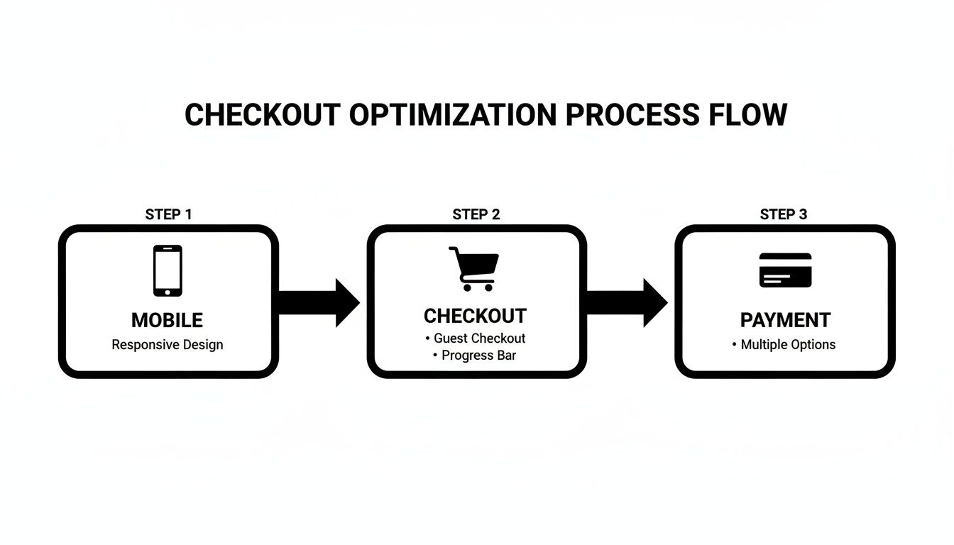
This really drives home the point that every step in the customer's journey matters. Optimizing each touchpoint, from the initial mobile search to the final payment confirmation, is essential for locking in that sale.
How to Prioritize What to Test Next
By now, you probably have a long laundry list of potential improvements. If you try to tackle everything at once, you’ll burn out your team and muddy your results. The secret is to prioritize the changes that promise the highest impact for the lowest effort.
Don't try to boil the ocean. A winning UX program is built on small, iterative wins. A 1% improvement every week adds up to massive gains over a year. This creates sustainable growth without overwhelming your resources.
Here’s a simple framework I use to decide what to fix first:
- High Impact, Low Effort: These are your quick wins, the low-hanging fruit. Think fixing broken links on top-selling product pages, clarifying a confusing headline, or making a CTA button pop. Do these immediately.
- High Impact, High Effort: These are the big projects, like a full checkout redesign or overhauling your site's navigation. Plan these carefully. They require resources and a solid strategy.
- Low Impact, Low Effort: These are minor tweaks—maybe changing some footer text or adjusting icon colors. Tackle these when you have downtime. They aren't going to make or break your quarter.
- Low Impact, High Effort: These are time-sinks with little proven benefit. Avoid these for now. Put them on the back burner indefinitely.
By tracking key metrics like your conversion rate, cart abandonment rate, and average order value before and after each change, you create a powerful feedback loop. This not only proves the value of your work to the rest of the company but also gives you the hard data you need to decide what to improve next.
Your Top UX Questions, Answered
Over the years, I've heard the same handful of UX questions from restaurant equipment store owners time and again. Everyone seems to hit similar roadblocks when trying to improve their site. Let's tackle the most common ones with some straightforward, actionable advice.
How Often Should I Really Be Doing a UX Audit?
A full-blown UX audit isn't something you do once and forget about. The digital landscape and your customers' habits just change too fast. I recommend a deep dive every 6-12 months to catch technical debt and stay on top of new user expectations.
That said, don't wait for the big audit to pay attention. You should be in your analytics every single month, keeping a close eye on your top exit pages and the health of your checkout funnel. This constant vigilance helps you plug small leaks before they turn into a flood of lost revenue.
What’s the Single Biggest UX Blunder You See?
Easy. Neglecting the mobile experience. It's the most common and, frankly, the most expensive mistake you can make.
Think about your customers: chefs, GMs, procurement managers. They're constantly on the move, researching a new combi oven between services or ordering replacement parts from their phone in the stockroom. If your site has tiny buttons, endless scrolling, or confusing navigation on a small screen, you’re not just frustrating them—you're actively pushing them toward your competitors.
A seamless, intuitive mobile journey isn't just a nice-to-have anymore. For a modern food service equipment supplier, it's absolutely fundamental to staying in business.
I'm on a Tight Budget. Where Do I Start?
If you have to pick one area, go straight for the checkout. No other part of your site has a more direct and immediate impact on your bottom line.
Start by digging into your analytics to see exactly where people are abandoning their carts. Then, use a session replay tool to watch what's actually happening on those pages. You'll be amazed at what you find. Often, you can see huge lifts from simple fixes like adding a guest checkout option or cutting a few unnecessary fields from your forms. It’s the definition of a high-impact, low-investment win.
Ready to turn your website into your hardest-working sales tool? At Restaurant Equipment SEO, we build specialized SEO and UX strategies that convert browsers into buyers. Let's map out a clear path to your growth.